As part of the Observing the 80s project, we wanted to produce some visual materials to counterpoint the other resources. We had some great audio recordings from the British Library Oral History collections and plenty of fascinating textual documents. But we thought that a few images or posters might help to open up some of the issues and episodes of the 80s and look good on the website, too! So we came up with the idea of producing a series of infographics to display selected data on relevant topics.
The term ‘infographics’ has gained currency lately with examples appearing all over the place. There are entire websites and online galleries devoted to them. But they aren’t a new idea at all. Florence Nightingale famously used innovative graphics to explain the high death rates among British soldiers and John Snow’s visual representation of the cholera epidemic in 1850s London is a particularly good early example – a kind of cross between a chart and a map. Produced at a time when the prevailing scientific opinion held that cholera spread as an airborne “miasma”, Snow’s image told a very different story. It provided compelling evidence that a particular water pump was the source of the illness and was vital to developing understanding of both the outbreak and the disease.
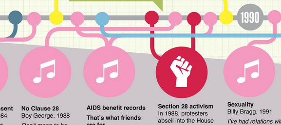
I think infographics have a lot of potential uses, especially in education where they can provide an alternative way of approaching a topic. For example, our graphic on sexuality in the 80s shows a timeline of cultural reactions, illustrating changing attitudes evidenced in music, television and film and giving a thought-provoking and quite succinct perspective on a complex issue.
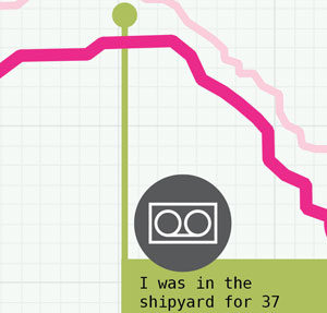
Graphics like these can help to highlight the resources made available by a project like Observing the 80s. So in one of the examples, there’s a fairly straightforward graph of unemployment figures rising and falling. But overlaid on this are excerpts from oral histories and Mass Observation archives. This exhibits the excellent source materials but it’s also a simple illustration of the human stories contained in the statistics and something that might be missing from a more conventional economic history.
The graphics have also been great fun to make. At the outset, we talked about colour palettes and how the eighties “looked”. We also compared graphics on album covers such as Duran Duran’s Rio. I tried to reflect some of this in the style of the images.
Stuart had already chosen a great typeface for the website and defined a bold, saturated colour palette. I expanded it slightly with some of the brighter colours prominent in 80s design – green, pink, orange – and developed an icon style to signify different sources of information. I’ve also tried to keep a consistent visual grammar so that the images work together as a set.


