It might feel daunting to create an accessible document from scratch. Luckily with just a few good design principles you can create wonderfully accessible documents in just a few simple steps.
Making documents accessible isn’t about making everything the same and restricting creativity, it’s about creating a document that is inclusive. Designing a document poorly may mean that some students will not get the benefit of it, or may miss out on crucial information that other learners will be getting and therefore be disadvantaged.
To help you with this, we have created our Digital Accessibility Toolkit, a collection of links and guides to best practice when it comes to making your resources digitally accessible. Below we’ve highlighted our top three tips for getting started. Be sure to check out the full toolkit on our webpages.
3 top tips for creating accessible resources
Tip 1: Use Heading styles
Make your work more accessible and reduce your workload? Impossible I hear you say, not with heading styles. Unless you need to have specific fonts or colours, then selecting heading styles does some of the work for you, they style your text accordingly. Not only that they also markup the text so that someone who screen reader or navigates with a keyboard instead of a mouse can easily navigate the document.

Tip 2: Add Alternative text.
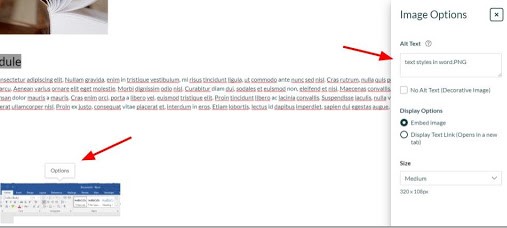
Videos and images are more popular on websites and modules sites than ever. It’s easy to create rich media content, but it’s just as easy to forget that there are some users who simply can’t hear or see the great content you are sharing with them. Our second top tip is Alt text, this can be a description of an image or closed captions on a video. There are a range of tools to support you with this, you can find guidance in the toolkit.

Tip 3: Provide materials in advance.
Whilst not strictly a design point, it helps. A great one for all your students, it gives them the opportunity to prepare questions or to do some advance reading. It is particularly useful for students whose first language isn’t English and students who may require more time for processing. It also gives opportunities for students to convert the materials into a format of their choosing, for example by using SensusAccess to convert a text document into an mp3 and listen to the reading on the bus on their way to the lecture.
There is of course much more you can and should do when creating and providing documents, pages and resources for teaching and learning, but follow these top tips and you’ll be making a great start.
If you need further guidance, support or want some sessions for you and your colleagues, please get in touch with us tel@sussex.ac.uk. We’re more than happy to help.


Thanks Dan. The Digital Accessibility Toolkit is really helpful.