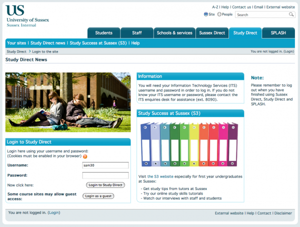
For Autumn 2010 the Study Direct team have been making changes to the way Study Direct looks and works to start to improve some the usability problems users have with the website.
2009 login page

The 2009 login page contained a lot of information and images, which pushed the actual login box down quite far down the screen. We found for users with smaller screens they often had to scroll to enter their login details. For users with screen readers this was a particular problem, as the login box was the very last thing on the page. Although the page has very clear and detailed text everywhere – generally users found it rather over-busy with no clear focus on what the page was, or what they could do here.
2010 login page

The page now – hopefully – tells you where you are, and what you can do here – sign in.
We also took the time to add a ‘Forgot your username or password’ link and some nice HTML5 form features including :
- placeholder text – letting the user know what they should enter into a form field
- autofocus – so the primary form field gets automatic focus when a page is loaded.
Combining the new HTML5 attributes with cleaner CSS and HTML also allowed us to make improvements to the usability, which has a knock-on effect for the accessibility of the page. The sections below the US header now render much clearer with CSS disabled, the TABLES previously used for the form layout have been removed making tabbing faster for screen readers.
The page is also loading much quicker.
Behind the scenes the page doesn’t load all the CSS and JAVASCRIPT libraries usually loaded on every Moodle page, as it does not need them. It just includes what’s actually necessary for the user to log in.
Some technical stats :
| Pre 2010 page | 2010 page | |
|---|---|---|
| Number of http requests | 35 | 10 |
| Size of received response | 522.7KB | 88.9KB |
By reducing the number of http requests to load files we did not need, and reducing the size of the responses by only sending back data we needed we managed to more than half the average page load time.
So far user feedback on the new layout has been very positive, and we hope to be making further improvements to the accessibility as soon.
One Trackback
[…] with the landing page re-design we took the oportunity to have a dig under the hood and try and improve the php, database queries, […]