← blogs.sussex.ac.uk

Ireland and UK Moodlemoot 2012

Two weeks have passed since the Ireland and UK Moodlemoot and a number of participants have written some excellent blog posts that summarise their experiences of the event. I thought I’d use this post to focus on one particular presentation – by my colleague Stuart Lamour. It may seem a little strange to be commenting on talk that I had heard in its draft stages several times before the conference, but I have been thinking about it quite a lot over the past fortnight.

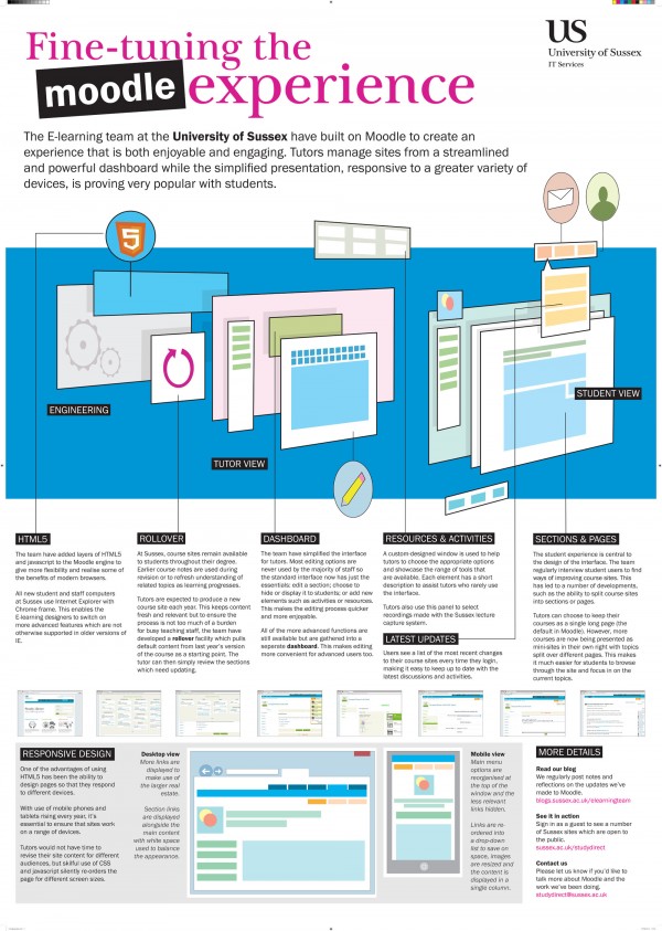
Stuart was presenting an overview of the changes we have made to our Moodle installation (branded as Study Direct) at the University of Sussex. These changes have focused on improving the user experience of Moodle, from both the staff and student perspective and are documented elsewhere in our team blog. Stuart’s presentation focused on techniques that the development team have deployed to identify issues with, and provide improvements to, Moodle’s usability.

Feedback on the presentation was extremely positive and Stuart’s talk was mentioned  as a conference highlight in a number of blog posts and tweets. Having thought about his presentation, I think there are three main reasons why the talk was received so warmly.

First, I think it gave an insight into what it was possible to do with the Moodle architecture and interface to provide a more intuitive, simplified and aesthetically pleasing user experience. In addition, by using Study Direct as the tool with which to give his presentation, Stuart managed to give the audience a real feel for how it worked.

Second, the presentation wasn’t simply a ‘this is what we did’ talk. It concluded with a call for us, as the Moodle community, to use the available forums to persuade Moodle HQ to give higher priority to usability issues.

Of course, this call to action can only work if people feel that action needs to be taken and this is the third, and most important reason, for the talk’s success. It became clear that there was a real appetite in the room to discuss Moodle usability and the user experience and to try and push it up the agenda within Moodle HQ. One of the suggestions given by those at Moodle HQ to raise the profile of usability was to post something to Moodle tracker – a site where users can post problems with Moodle and suggestions for improvement. Whilst there was lots of feedback via Twitter to suggest that people would now use Moodle tracker, others felt that Moodle needed to build UX principles into its core development – a blog post by James Clay and a post by Dominik Lukeš reflected these feelings.

In his Moodlemoot keynote, Martin Dougiamas did state that usability was one of the priorities on the Moodle development roadmap. Moodle HQ is seeking to address some of the system’s usability problems in future releases – Martin  has recently posted a proposal for paged course formats that will try to minimise the ‘scroll of death’ that users encounter when they encounter sites with a large number of topics. It will be interesting to see how they develop their user testing processes and how (and, equally importantly, when) they involve the community in this process.

The reason why I wanted to write this post was because Stuart’s presentation was quite a rare beast – it clearly made an impact with the immediate audience at the conference, but may also have a more lasting legacy by encouraging us, as a user community, to give feedback to Moodle and to try and make the experience of using the system even better than it is already.

And I don’t think you can ask much more of a 15-minute presentation.
Favourite Moodle courses

Our Moodle users can have a lot of course sites, but they usually only visit a few of them regularly.

In order to make their lives easier we have introduced the concept of “favouriting”. When a user favourites a site it rises to the top of their site list. And when they unfavourite it it returns to the bottom of the list.

Apart from the improvements in efficiency they are likely to enjoy this interaction.

[vimeo]http://vimeo.com/39336617[/vimeo]

Simplifying a Moodle form

I used to think that a good virtual learning environment was the one that was the most flexible. If the technology could enable it, it should enable it. But I could not understand why so few of Sussex tutors ever explored the options that were possible.

In 2009 my new colleague Stuart Lamour introduced me to a fundamental principle of form usability – tutors did not want more options, they wanted less! They did not want to be exposed to the complexity of what was possible, they just wanted a few simple options that would make their lives easier.

Throughout our Moodle we have forms with options that are rarely used. We are slowly going through these and making them simpler to use. In this blog post I illustrate how I have simplified the enrolments settings of the course settings form using user experience design patterns, intelligent defaults and progressive disclosure.

The first thing we did was to split up the course settings form and put the various sections on to different pages. These were all available through another Sussex development – the course administration dashboard.

Many enrolment options were not relevant to courses that were created and populated by the automated course feed. As a result the vast majority of courses only need four enrolment options – does it allow guest access, is it enrollable, and if so, do guests or enrolling users need a key and what role do enrolling users enter with.

Those courses which have been created manually and manage their enrolments in other ways need more enrolment options. These include: is it a meta course, is the enrolment period between a date range, is there an enrolment duration and, if so, are there enrolment expiration notifications.

Many of the options only make sense if another field is set in a certain way, for example if a course is a meta it cannot be enrollable. This means we can enable and disable fields according to other form settings, thus making the form even clearer.

The following video illustrates what we have done, but please note we use some different terms. For example we call Moodle enrolments “subscriptions” to disambiguate from University courses and enrolments to them and we avoid the term “meta course” as we think it will confuse our tutors. Instead we say “take subscriptions from other sites”.

[vimeo]http://vimeo.com/38492466[/vimeo]

Google docs and Moodle integration

Collaborative working is a useful practice to enhance learning. Online document sharing such as that possible with Google docs provides a platform for collaborative working online.  This is one of the reasons why we are excited by the possibility of a Google docs and Moodle integration.

Another reason we are excited by the integration is that Google docs provides friendly access to file types that are otherwise difficult or impossible to view on mobile and tablet devices. This is particularly important as access to our Moodle through mobiles and tablets increased five times since the same time last year and articles such as “Why mobile matters” lead us to believe that our Moodle will soon be accessed more by mobile and tablet devices than laptops or desktops.

On a development Moodle install we have integrated Google docs and Moodle. On this system a tutor can make files available through a download, Google docs itself for collaborative work or a Google docs viewer respecting the Moodle permissions.

[vimeo]http://vimeo.com/38095075[/vimeo]

There are issues about allowing our files to be accessed by Google docs as the files become subject to the standard Web 2 licensing models. We don’t know how our academics would respond to this. We are investigating other options too such as Crocodocs and Zoho viewer.

I welcome any comments or suggestions regarding the issues that this integration raises.

Security and technical details

The Google file viewer can respect the Moodle permissions. This is how we did it.

When the Google file viewer views a file  it does not have the user or session variables available and so the script which serves the file cannot require login.

To get around this we write a record storing the url and time of access is written to a database table at the time of selecting to view the file. When the Google file viewer attempts to view the file, the url and time (within a second) must match the record just written. If they match the file viewer can access the file and the record is deleted, otherwise access is denied.

We figured out the technical details with Moodle developer Mark Johnson at the 2012 Dev8D conference.

Moodle help

Academics are increasingly expected to make resources for their students available online, however few are skilled at creating web pages. Ideally their online platform (VLE) should be as intuitive as possible for them to use. Where it is not intuitive the help for using the system should be as good as possible. In December we redesigned our help to meet this challenge.

In the past we used a multilayered approach to help. We had the standard Moodle help methods, that explained how to do things but not how they would benefit their teaching, and the standard Sussex University FAQ system for providing help that we could tailor to our understanding of our users’ needs. The problem was that the user experience of help was fragmented – the Moodle help was too technical and the Sussex FAQs were on a different system.  We therefore decided to create a help page within our Moodle install that looks-up the IT Services FAQs.

When designing the look and navigation of our help pages we looked at other modern web applications including Facebook, WordPress, GooglePlus and Dropbox.

We found help was consistently linked to on the right hand side of the top horizontal navigation tool bar, used search as a primary means of navigation and had a list of categories that the user could browse.

We liked sites that gave the user the ability to feedback the usefulness of the FAQ. We felt that made the help more personal and interactive.

And we liked sites where help included the name (and face!) of the user who last updated it, because there was a human to contact for more information about the subject.

And we liked sites which enabled the help to be printed easily.

Furthermore, we found that the logical categorisation of FAQs improved ease of navigation.

We found that the wording was important so that users could immediately identify if the FAQ would be of interest to them. Having rule sets for the creation of FAQs meant there was a consistency about the user experience.

When writing our FAQs we wished to reinforce Moodle terminologies, such as Sections, Blocks, Resources and Activities. Maintaining Moodle terminology was important so that users who looked for help outside our institution would not be confused. However, we added terms that the user used to the keywords so that our FAQs would be found in their searches.

Because we did not have evidence of the language used by our tutors we are tracking search terms used. This means that when we revisit the help pages we can start to rephrase the language so it is even more usable by our users. Furthermore tracking user searches will help us identify area which our FAQs do not cover.

We found that the search needed to use a meaningful algorithm. We wanted searches matching the question or keywords to be returned before searches that found the word in FAQ answers.

Moodle mobile & the future of moodle

Responsive design in moodle

A cross platform vle?

With the increasing predominance of smart phones and tablets it is highly likely that any institution running some form of analytics will have seen the rise in their moodle site being accessed by Blackberry, IPhone & IPad and the ever increasing march of Android.

It’s predicted that by 2013 there will be more of what we call mobile devices accessing your website, than desktop.  As a browser based open source CMS moodle is perfect for being viewed in all these internet ready devices, but needs a bit of tweaking.

Moodle at its core wasn’t built to consider such devices. Pop-up windows, tables, iframes, the forms library, the lack of support for grid layouts, poor usability, an ancient WYSIWYG editor (moodle1.9) and many other odd things dwell in the core moodles framework, and indeed Moodle HQ have noted the fact that it “requires huge core changes to Moodle” to make moodle work in the current browser/mobile landscape.

For us as users and developers such changes would not only improve moodle for mobile users, but for all users. Almost all modern open source browser based CMSs are currently updating, or already have done, to support mobile users and current browsers. Those that don’t i fear will disappear.

So what is the current state of moodle for mobile users?

Moodle News pointed us in the direction of the moodle plans for mobile.

It turned out moodle have some wireframes and a plan for developing a plethra of platform specific apps.

The plan suggested hiring app developers, and using moodle2 web services to deliver content into these applications. Their are no details available on testing these wireframes with actual moodle users.

A moodle iphone app was released. Which causes some problems.

The implications are that anyone with a customised moodle would have to customise and release their own suit of native moodle apps. Individual institutional data you include in your moodle, which a standard moodle does not, would simply not be included in the moodle standard app.

At Sussex we do not currently support or maintain a native moodle app for our Windows, Mac OS or Linux machines. Patches to platform specific apps are something not currently included in our development cycles. We use moodle because its an open source browser based CMS – it crosses these boundaries to unite all our systems.

The app we use for moodle is the browser.

The app stores – one size fits all

Apps can be great – Apple are able to designing a native mobile interface for most of their systems, with fantastic results. But moodle isn’t Apple, Facebook or any of the other one size fits all service providers. As with any open source CMS we expect to able to customise our users experience of moodle, to fit there needs.

Developing the iphone app should not been seen as a waste of time. As with apple themselves the lessons learned from creating a lean user experience can be fed back in and become beneficial to moodle.

In moodle – one size does not fit all

The ecological diversity of moodles out there tells us people use moodle for very different things. People customise moodle. People want different workflows and focus from their moodle. Moodle has never been a one size fits all product which most native apps, by their nature, are. People have already developed their own moodle apps for their diverse requirements from moodle.

Other CMS systems like the Wordpress app allows editors to curate content (a standard workflow), but there is no official app to view the front end of every worpress site in this specific style for a very good reason. Drupal have never released a one size fits all suite of platform specific naive apps because they except their strength lies in the ability of their customers to mould the product to fit the business and user requirements – as moodle needs to.

From our own tests, with a variety of mobile devices, moodle is very close to working well on mobile and tablet already. Patching the issues in moodle isn’t something we can do alone – it needs a encouragement from the community. At Sussex we would prefer to see moodle’s energy put towards updating and developing the open source browser based CMS we love. We’d like moodle and the communities time and energy put towards supporting the future for all users, rather than any one size fits all platform specific native app development.


Best practice on the web

Moodle’s pursuit of apps sits rather uneasily with current web community best practices for mobile. Moodle is lucky enough to be a browser based CMS when there has never been a better time to be one!

The now famous A List Apart article showed us how to technically shape content for small screen.

Moodle2 happily incorporates parts of the community browser best practice code form html5boilerplate. So why not html5boilerplatemobile ?

CSS3 enables us to use media queries  and it would be great to have moodle featured on mediaqueri.es – the gallery which shows some of the best use of this pattern.

The open university has a pattern library/online style guides which utilise these media queries, and we are looking forward to seeing this implemented in their moodle.

The ‘recently acquired by adobe’ phonegap project lets us interface with mobile apis for upload etc..

And while your moodle may not currently be mobile/tablet/modern browser supportive, their are ways around it.

Anyone who read or saw the Jquery UI Mobile presentation by filament goup (highly recommended) will know of the projects objective as a browser based framework for mobiles and tablets.

John Stabinger ‘s  moodle2 mobile based on Jquery Mobile theme gives you a moodle web app.

The future of moodle?

We would love it if moodle accepts and learns to embrace what it is – a browser based open source CMS – and what a great time it is to be one.

Brighton UX 2011 notes

Brighton UX 2011 notes + linkdump

  • Dunbar’s number (approx. 150) can be a good guide for cohort sizes in e-learning as well as soical media
  • Boys like to ‘do stuff’ together to re-enforce social groups, girls like to ‘chat’ to re-enforce friendships – what implications does this have for the types of online activities you might provide for different cohorts?
  • By 2013 the majority of your users will be accessing your content through a ‘mobile device’. Start planning for this today.
  • Word docs, Powerpoint, pdfs – Does your ‘offline’ content work on mobile? (its a guessing game, but mostly no!)
  • Users performing a single task may be doing so through many different interfaces (including face to face, the internet, a telephone conversation). A strong, cohesive IA which crosses all these channels gives a better user experience (Pervasive IA).
  • We are all physical beings – People think about things, not ‘document groups’. A good UX leverages the semantics of a real world, not document types, as its structure.
  • UX doesn’t start with wireframes, it start with understanding & often defining the domain model. Far too often these days – frequently in large organisations, unfortunately including the education sector – ux is mistaken for a nice css/javascript/html interface. User Experience design is not, and should never be seen as, fixing a domain through by a nice interaction design level.
  • Your ‘homepage’ may no longer be the content entry point for most users. Search, deep linking etc all give visitors different entry points you need to anticipate. Put 70% of your effort into the content pages, not your ‘homepage’.
  • There is a derogatory image of  older users. ‘Older users’ (in the UK > 50, EU > 45 ) technological needs are often very similar to other age groups.
  • Behavioural cohorts are often better than personas – for all users.
  • Users would often be happier to pay more for something simpler, with less features.
  • A good UX project can be as/more powerful than a business consultant (electronicink)
  • Our brains have become addicted to the constant random releases of dopamine we get through services such as facebook, text messages, twitter and other notifications. Our use of these can be comparable to adhd.
  • There is no such thing as a good multi-tasker. It is a fallacy.  Each cognitive task has a cost, and the user becomes less and less effective.
  • Users are can now take these additive interfaces into distracting environments.
  • The ‘addictive’ designs we most admire are often the designs that are killing our users. There was a 20% drop in road accidents in the US during the recent period of Blackberry messaging downtime.
  • Design strategies for coping with adhd/multi-tasking today –
    • Turn stuff off by default. People like adding stuff. People hate making the cognative choice to disable/turn stuff off.
    • Create focus on the important, and remove the distracting.
    • Increase users motivation by creating an ability to grow mindset instead of a fixed mindset (http://www.brainology.us/). Let users set their own goals or just do as much as they like.
    • Decrease pressure – only ask for as much information/detail as you really need.
    • Give focus when returning to a task (e.g. the kindle ipad app highlights the section your were previously reading on your kindle, and vice versa)
  • It makes sense, and we could have a social responsibility, to design for distracting environments (Giles Colborne).
  • People connect – watching a user testing session is much more powerful than reading about it.
  • IA has changed – how the BBC learned to look Beyond the polar bear.
  • The web has changed – how to be Future friendly.
  • UX is changing –
    • context – where you use the web
    • outputs – display diversity
    • inputs – mouse/keyboard/remotes/freespace gestures!
    • connection – isp gives you loads, mobile restricts – offline web etc
    • ecosystems – content goes cross device  e.g. watching a video from your phone on plasma screen, reading a webpage with instapaper on a kindle etc..
    • Can the classic set of UX Design deliverables cope with the ‘wider’ web?

= lots of interesting and practical stuff.

I wholeheartedly enjoyed this years UX Brighton. Thanks to Danny & co for organising.

moodle dashboard

The information architecture of moodle can be rather confusing for both students & tutors.

One of the reasons for this, suggested by our users, is that in comparison to most other web based content management systems moodle has no clear separation between the course editing settings and the front end.

Having this separation of a front end user interface & an editor facing interface is a well used pattern which makes it simpler for content editors to know where to perform a task. It makes your web pages a lot less cluttered. It also helps emphasise to editors what students can see, and cannot.

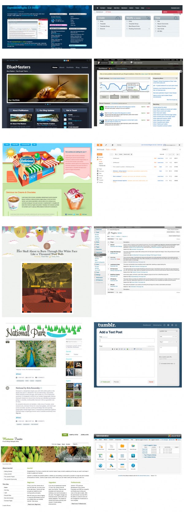
Front end vs editor patterns from popular cms

{click the image for larger view}

For most web based cms the differences between the front end most users see, and the editor interface are very clear. The workflow editors follow is clear. The front end ui remains uncluttered by admin links, and the dashboard user interface is clean and simple.

For our moodle at Sussex we will be launching a new development which tries to bring moodle more inline with these other cms by introducing an editor dashboard pattern.

A dashboard for moodle

[vimeo]http://vimeo.com/31367166[/vimeo]

We already have exciting plans on how to improve this moodle dashboard. Once you have a simpler editor pattern & information architecture you already know exactly where new features/content live – it makes extensions and new developments much clearer. I’m sure you can all think of some too!

The changes for our users are obvious, but introducing this separation also has some technical implications.

Technical advantages

From a technical perspective separating out these content editor parts of your cms from the non-editing user view you stand to make your system leaner and cleaner.

Web based cms generally have a standard look for the editor pages, while the non-editor view can have a custom theme/skin. Editor pages are, by their nature, heavier in load of javascript, css, php and database queries – while the non-editor view can often be extremely light with less db/php but could have js intensive or fancy ui interactions. The separation allows you to only load what is necessary (a particular js library,css, a db query) for the type of user – giving both admin and non-admin a better user experience.

By separating an editor pages writing a theme becomes much easier – you only do so for the non-editor pages. Writing a plugin becomes much simpler – the admin ui only has to work with one theme – the default cms editor theme.

The future of moodle?

This information architecture pattern of separating the editor/admin and users view can be seen all over the web, and we would very much like to see it as an information architecture pattern adopted by moodle at some point in the future. As always, your comments are very much welcome.

Course yearly transition tool

At Sussex we maintain Moodle courses for the students’ programme duration (see this post). This means that each academic year we create new empty Moodle courses for academics to develop. Unsurprising most academic want to copy their courses from the previous year. However the native tools for doing this (import and backup-and-restore) are over complicated.

We were impressed when in UK 2011 Moodlemoot the University of Kent demonstrated the solution they had implemented. This was a simple tool to schedule a rollover from another course. Unfortunately they were not able to share this tool and so we have endeavoured to recreate it.

When a tutor comes to an empty 2011/2012 Moodle course site they are given the option to copy an existing site into it by scheduling a rollover. When the rollover is successfully completed the academic is informed via email. If there are problems with the process the e-learning team is informed so they can resolve the issue before the academic is aware of it.

Unlike the University of Kent we based the Sussex rollover tool on the existing Moodle backup and restore functionality. This means that it has not removed the unreliability of the process caused by PHP memory issues, but we should be able to hide some of the issues from the academics.

For a demonstration of the recent updates feature please view our video. Please note our Moodle install is called Study Direct and we call each Moodle course a “site”.

[vimeo]http://vimeo.com/38491323[/vimeo]