← blogs.sussex.ac.uk

First phase of Me2U coming to an end…

So, we are now already four months into the project and this blog post provides an overview of where we’ve got to….

The project aimed to recruit ten lecturers to participate in the project and we decided to enlist three participants for the first phase (October – December) – the rationale being that any teething problems with the technology would be likely to occur in this phase and we may want to refine our evaluation methods in light of our initial findings.

Two of our the three participants were from the School of Psychology with a third from School of Global Studies (Department of Geography) and they have used PCAP in a number of exciting ways.

  • One of the Psychology lecturers used it to help student to prepare for a computer lab class by recording a walk-through of the web-based resources that student would need to access during the lab.
  • The other Psychology tutor used PCAP to record student presentations – giving  students the ability to review their presentations alongside the feedback received from the tutor. The students agreed to be recorded using PCAP on the condition that the tutor recorded the series of lectures (pretty canny students if you ask me)
  • The lecturer in Geography used it to both provide resources that complemented his lectures (see screenshot, below) and to give some pointers to a mid-term test  and  some feedback to the cohort on the test.

We have been evaluating the students’ experiences through questionnaires and we are in the process of analysing these data. At first glance, student experiences have been very positive. I guess this isn’t so surprising – we know that students like resources to support their learning – so we are now running focus groups with students to  try and unpick why they feel that this medium could be a valuable tool for learning. We are also interviewing the staff to evaluate the extent to which they feel the recordings are a useful learning tool and to gauge how long it takes to make a recording.

We’ll be writing about these findings and our next phase of the project soon.

Things we love about moodle2 pt2 – experimenting with themes

One of the changes in moodle2 has been in the implementation of themes.

We already talked in a previous blogpost about the ability in moodle2 themes to include and exclude css & javascript from a themes parent. We appreciate this inheritance model which makes it simpler to have a base css, and vastly change the appearance of your whole site with  relatively few, clear lines of css.

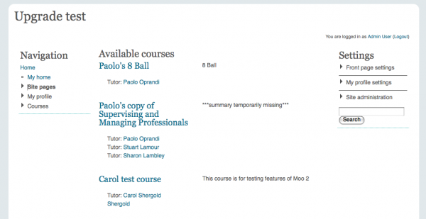
It took us about 5mins to implement a ‘nude’ Sussex style-sheet in moodle2.

The process

Following the guidlines for moodle2 themes we created a sussex theme folder, edited the config file, imported the layout files from base, and set our parent theme to base.

Like many of the themes already created we included Paul Irish‘s html5boilerplate css – which includes Eric Meyer‘s reset realoded and a gives us a nice basic usability baseline.

In the sussex theme folder we created 2 stylesheets – layout and text.


/*LAYOUT CSS */
html,body {
background-color:#E1E8EB;
}
#page-wrapper {
width:990px;
background-color:white;
-moz-border-radius: 1em;
border-radius: 1em;
margin:1em auto;
padding:1em;
}


/* TEXT CSS */
html, body, select, input, textarea {
font-family: Geneva,Verdana,Tahoma,sans-serif;
color:#555555;
}
body, div, span, blockquote, p, li, pre,
abbr, address, cite, code,
fieldset, form, label, legend,
table, caption, tbody, tfoot, thead, tr, th, td,
article, aside, canvas, details, figcaption, figure, footer, header, hgroup, menu, nav, section, summary,time, mark, audio, video {
font-size:14px;
line-height:1.5em;
}
h1,h2,h3,h4,h5,h6 {
font-family:Georgia,serif;
font-weight:400;
}
/*LINKS */
a, a:link, a:visited {
color: #11718F;
text-decoration: none;
}
a:hover {
color:#224857;
text-decoration:underline;
}

Here a screenshot of the results :

As you can see, it’s a ridiculously small amount of css to produce something remarkably similar to our current moodle style (which uses far more css).

Bonus fun

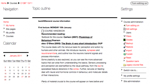
Again, limited CSS for a SWISS style ultra thin Helvetica theme, with bold underlines and lots of white space :

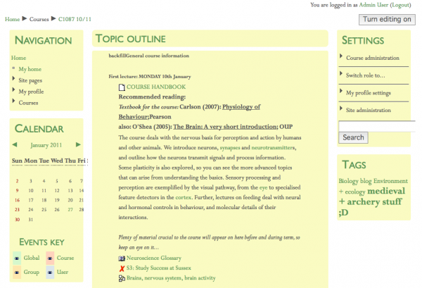
Using a almost the same CSS to try a quick Eric Gill ‘nude’ theme using Gill Sans and Perpetua :

Obviously, the sussex style sheet isn’t yet complete – but from an initial perspective moodle2’s new ways of creating themes seem a big win.

Things we love about moodle2 pt1 – minify, gzip & exclude

In moodle 1.9 we spent a lot of time optimising the page load speeds and improving the quality of our code.

Using tools including:

allowed us to analyses what was slowing pages down, and how to improve this.

1. Minify and compress

Moodle2 comes with built in minify and gzipping for css and javascript!

2. Load things in the right place

Moodle2 theme config.php allows us to load javascript in the footer of the page instead of the header :
$THEME->javascripts_footer = array();

3. Don’t load things you don’t need

Moodle2 allows us to exclude parent theme css and javascript :

$THEME->parents_exclude_javascripts = array();
$THEME->parents_exclude_sheets = array();

Minifying javascript can create some interesting results, so the fact that the moodle2 team thought about and managed to do this is very much appreciated.

For anyone interested in speeding up their site – the best practice guidelines by yahoo & google (along with the tools above) can be an interesting insight into improving things for your users, and making your code better.

So far, we are just evaluating a test install of moodle2, but will be updating the blog with further findings.

Introduction to the Me2U project – Echo360 personal capture for student learning

Echo360 logo

In August 2010, a proposal submitted by a team from the University of Sussex, UK was awarded funding as part of the Echo360 grants programme. The project, called ‘Me2U’ (on reflection, a title perhaps too close to the  Chuckle Brothers catchphrase), has set out to investigate the ways in which the personal capture version of Echo360 (PCAP) can be used to support student learning. Echo360 PCAP can be installed on a laptop and will record what is displayed on the screen, an audio track and a video feed from a webcam. It then produces the recording in three files formats – flash, m4v and mp3.

One of the advantages that we see with Echo360 PCAP is that its interface is very simple and it does not require any specialist knowledge about converting a recording into an appropriate file type. The process by which a recording is published is exactly the same as that used in the Echo360 lecture theatre set up. Users do not, therefore, require any further technical guidance, freeing them to focus on the pedagogic aspects of the recordings.

What we are really interested in finding out is how short recordings can, for example:

  • help students know where they are going with the course, how it might relate to other courses and what the tutor expects;
  • clarify questions raised by students on a particular topic or concept, or prepare students for their first piece of assessment;
  • provide an end-of-course synopsis or help prepare for the end of year exams.

Our first phase is underway – we are supporting those involved in the creating recordings – both in how to use the software and discussing the kinds of recordings they could make.

We’ll be providing updates on how the project is progessing through the e-learning blog.

Journey with a magic pen

I like using a pen and paper for note-taking and for ideas generation.

Even though I’m a pretty fast touch typist, I find that making hand-written notes feels more expressive.

  • I like being able to annotate text I’ve already written.
  • I like the ability to make doodling/ diagramming part of the thinking process
  • I like using white space in my layout to help order and structure the text
  • I like the informality and aesthetics of hand writing

BUT

  • I end up carrying old notebooks around with me for ages because they still contain some material I need, even when I’ve moved onto a new notebook
  • If I forget to carry my notebook with me, sometimes I can’t access important information
  • It can take a long time to find a particular note that I need to access
  • It’s not very easy to cross check notes to find all the instances where a particular issue has been discussed

So I was quite excited when our Teaching and Learning Development Unit offered me the opportunity to take a Pulse Livescribe pen with me to ALT-C 2010 earlier this month.

The Pulse Livescribe smart pen contains a miniature camera and a recording device. When you write with it on special “dot” paper, it is able to track the coordinates of all of your pen strokes and record exactly what you’ve written and where you’ve written it.

Then when you dock the pen with your PC or Mac, it can upload all of your notes.

It then indexes them.

Oh, and it lets you make an audio recording. These recordings are synchronised with the stream of pen strokes that the device captures. This also allows you to use your written notes as an index into the recordings you’ve made.

So what was it like using the Pulse livescribe pen at a conference?

handwritten text, saying "neaten up"
First of all, I discovered that in order for the character recognition software to work, I was going to have to serious neaten up my hand writing. But for anyone who knows me and has tried to decipher post-it notes addressed to them – this is no bad thing.

Assuming I can actually write neat enough, getting all my notes searchable feels like a pretty powerful outcome.

Now I can do searches across all of my Alt-C notes for themes I was tracking at the conference. The image below shows the result set for a search of the term “feedback”:

Screenshot of search results

I had a seriously excited moment when I thought that I might be able to index all notes I took in all meetings, and manage my entire working life using this little pen.

But when I downloaded the MyScript tool to do this (available for a trial license from the Livescribe website) I found out that this was a bit optimistic. My handwritten phrase “the science of learning” became “the silence of turning”. Maybe my life wasn’t going to be transformed.

Why then did the search function work so well? The software is indexing any single hand-written word against a number of possible text matches. So whether I searched my notes for “science” or for “silence”, I would find the same hand-written word being highlighted in my notes.

SO, did I keep using the Livescribe pen? I had to give it back for someone else to use and I didn’t really miss it.

I think if I used audio recordings more as a way of making notes, I would find it very beneficial for my notes to function as an index into the relevant part of the audio.

If I was able to write neatly enough for the MyScript tool to decode my notes, I would definitely use it.

For now though, I’ll wait and see ..

Moodle developments – adding pedagogical context to selecting resources and activities

Moodle has a plethora of options of types of learning materials a tutor can add to their site.

Anyone editing in moodle is used to two very familiar drop down menus as the main methods for adding content.

Add a resource

Add an activity

The problem

Examining the sites tutors built at Sussex showed us they tended used a limited set of these.

Bariers

Interviews with tutors brought up some interesting issues with these drop down menus and the language used, verses the aims of the tutors and the support they needed.

Time is always a premium to our tutors and so they simply didn’t have time to try adding things they didn’t understand or know if they would perform the task they wanted.

Our solution

We replaced the two dropdown menu with two buttons.

Clicking on the buttons brings up a model dialogue of the options.

The resources a user can add are shown in clear sections, based on tasks. e.g. The Create Pages section contains links to add a web page, text page or our custom youtube page.

Each resource has supporting text, detailing at a glance what the resource enables the user to do, and a link to help with the resource. This comes into its own with activites, where tutors may be unfamiliar with concepts such as a wiki, and if using an activity can help them achieve their learning aims for the site.

By removing some of the jargon labels, splitting resources and activities into task based sections, and adding brief inline descriptions we hope to help our tutors pick the right tools for the learning outcomes they want to achieve.

Moodle Developments – File upload & management pt1

As a large HE  using moodle one of the main problems our Staff and Tutors have with moodle is file management.

On a daily basis our tutors, academics and staff use our moodle install at Sussex to add pdfs, powerpoints, word docs and other teaching materials to their sites in order to make them available for students.

Students love the fact that this wealth of material is available to them. Tutors struggle with making it available to them.

Moodle does provides a fantastic framework for security, permissions and the backend of file management, but our content creators (lecturers and staff) often struggle with the front end interface – so we decided to improve it for them.

User interviews

How do our users use moodle?

We began by conducting a series of one to one sessions with some of our expert users – those tutors, lecturers and researchers who regularly create fantastic e-learning experiences for their students. In these sessions we visited theses expert users in their own environment, observing their daily use of moodle.  We also asked them how they would like it to work, and to show us other websites or applications they commonly use to do similar tasks.

How do other ‘products’ do file upload &  management?

We looked at some other web based CMS (content management systems), commonly used websites (facebook, twitter, google docs, dropbox etc) and applications our tutors use (word, powerpoint etc).

Initial findings

Our first finding was to do with the different ways users can add a file in moodle. There were two different methods – both with very different workflows – our expert users commonly used to add files.

1. Add a resource – Link to a File or Website

When editing is on users can select from the dropdown menu an option to upload a file called “Link to a File or Website”. From a developer perspective this seems perfectly legitimate – a link in html does not care if its to an asset on the same site, or another website.

From a language and user aim perspective our users had a great deal of difficulty with this concept and the labelling.

Users suggested “Upload a file” would be a more appropriate label. It should be noted that these expert users use moodle every day, but unfortunately still find it a struggle to remember how to do some of the common, repeated activities. This would indicate a more intuitive process – based on the language and tasks the user needs to carry out – would be more appropriate for our interface we give to users.

Adding a resource form

The standard form for adding a file resource in moodle brought up some interesting usability challenges for our tutors.

Window & other form elements

The form itself has a large number of options for opening the resource in a frame, a pop-up window, showing navigation, menu bars, location bars, the size of the window etc..

Many of our users were unaware of the implications of these setting for the end user, the usability and accessibility problems associated with setting these options incorrectly, what the size in pixles of there resource – or indeed a page is, what a status bar is etc…

As developers we know most of these options can be ignored. We know that best practice tells us never to use frames and to open files such as pdfs and word documents with the appropriate application and not with a browser.  We know that images, movies and audio can be displayed in most browsers. This is a complex set of web content rules we learn, but we found most of our users had no conception of these rules or (understandably) any wish to learn them.

For users with limited time, trying to complete a relatively simple task which other systems allow them to easily, presenting this hi-level of control and complexity was unwelcome. This generally applied to all standard moodle elements of form.

Generally we found our users just wanted to add a file, and for it to work.

Choose or upload a file form / pop-up window

The Choose a file button opened a pop-up window (by default – blocked) presenting the moodle standard file interface. One user stated that to reach this page they had now clicked / requested to upload a file three times, and seemed no nearer their goal.

Many users spent a while on this page searching for the (bottom right) upload a new file button.

Comparing to other systems users found the lack of a progress indicator, and error messages if the file was large to be frustrating.

Once uploaded none of the 12 expert moodle users interviewed were immediately able to find the Action > Choose button immediately, with many clicking on the file name. Those users with a lot of files were often unable to spot if the upload had been successful or if the file was listed in their list of files.

It was interesting to see the number of users who did not seem to be using folders to organise their files online, but would do on their personal computer. When questioned further users tended to not look favourably on the  method of creating folders and moving files within moodle. Users were also unsure if link integrity would be maintained when files were renamed or moved.

Searching the moodle forums had shown that moodle developers were aware of the issues with this process and in the process re-working it for moodle2. Unfortunately on our large production site we cannot wait for moodle2 and need to address some of the issues to make life easier for our primary asset – our content creators.

2. Through the html/WYSIWYG editor

In our staff training courses at Sussex we encourage users to use the first method for adding files, but many found it more familiar to do so thought the WYSIWYG html editor in moodle. This seemed to be a workflow users were more familiar with, and enabled them to easily add contextual information relating to the resource.

Improvement requirements

From our initial investigation a clear set of requirements emerged.

Basics

  • Clear and simple labelling for tasks
  • Reduced complexity, jargon and options
  • Better layout for primary actions
  • A progress bar for uploads
  • Clear indications of success / failure in a task
  • Intuitive file selection (e.g. onclick)

Advanced

  • Less clicks to perform a task
  • Helpful and meaningful guidance text during task
  • Improve ability to organise files online – e.g. rename, move, preview
  • Intelligent best practice display of resources based on mimi type – e.g.  pdfs = download, audio = play in browser
  • Helpful and meaningful error messages
  • Avoid the use of pop-ups which modern browsers block

Additional requirements

During interviews users also mentioned uploading multiple files. This was not an issue when adding single resource, but in more general file management of site files. Many lecturers have a folder of lecture slides and would like to make them all available, but currently have to individually choose each one – a slow and painful process. Users are familiar with, but not competent, in zipping files. Users said  the ability to select more than one file to upload at once would improve their workflow considerably.

  • Multiple file upload

Our solution

We demonstrated the new file management tools at the Study Direct user group meeting in June 2010.

[vimeo]http://vimeo.com/13646116[/vimeo]

Next time…

In the next of these post we talk about wireframeing, prototyping and testing improvements to file upload including technical details of our implementation in moodle 1.9.

2010 Study Direct landing page

Again, following a usability study of our moodle install Study Direct at the University of Sussex the team began to make some improvements to the ‘Your sites’ page which lists the course sites users have access to.

Sites by year

At Sussex a site for each course is created each year, with Students and Tutors for the site pulled in from our central database. Students and Tutors can go back and look at previous years sites and find this very useful. It can however prove confusing in moodle where a user could have many sites with exactly the same name – from different years. Tutors, for example, can teach the same course each year and have sites for every year they have been teaching the course. To help us organise this we keep meta-data about the course year, study level and term (Spring, Autum etc..) in the moodle database and can use it to organise how we show sites to users.

The new ‘Your sites’ page takes full advantage of this – organising sites into :

Current sites – sites from the current academic year & sites which do not have any academic year but run continuously

and individual academic years – in the screen shot below 08-09, 07-08 and 05-06

We presented these initial ideas at a user group meeting for june 2010 – shown in the video below.

So far this seemed to be an approach users like, and after further consultation with users we started to implement it in moodle with some more features the users requested.

Displaying site metadata

In the screen shot below you can see Accuracy in Academic Communications is an Autumn 09-10 Undergraduate course. Colour coding is given to the term data – brown for autumn, green for spring and yellow for summer – as an added differentiator.

Sites which are in ‘draft’ – i.e. not published to Students – are shown to Tutors only with a message, and yellow background.

Site roles & clustering of colleague sites

The role a user has in each site is displayed clearly on the right hand side.

One of the problems some staff face is the sheer number of sites they have access to. Some Staff may have access to all the sites in their department or school. To ‘hide’ these sites they may not be directly responsible for, but need access to, a special list called Colleague sites was created. In the screen shot below you can see a link to the Colleague sites i have access to.

Encouraging interaction

It’s not always easy on moodle sites, without clicking into the individual site, to see if any activity such as forum discussions has occurred since your last visit, so we pull this data out and show it under each site. In the screen shot below Stuart’s site has a Forum Update, with the time since the post shown in a ‘twitter’ style – 4 seconds ago.

Other activities including for a site are accessible directly from  this page – e.g in the screen shot below afterSuss : Career Development Course shows Assignments and Quizzes. By clicking on these buttons details of the activity are displayed, including the number submitted, if it has been graded, due date and other relevant date the user is allowed to see.

Reducing ‘noise’

The screen-shot of the older Your Sites pages shows what a pretty typical user would see, and uses an off the shelf moodle style. User feedback suggested blocks on the page – although useful for admin users – were infact never clicked by most users. Information shown by default about each site e.g. user role, activities and updates –  was also mostly unread, possible due to the sheer amount of data and lack of differentiation in its display.

The page itself is called Your sites and has one primary task – to display the sites a user has access to. So why do we need all the other functionality of the page? By concentrating on doing the one simple primary task in the best way possible we hope to create a better user experience for all our visitors.

Styling the page

To help bring emphasis to forum posts users picture icons are shown, and as previously mentioned, the date since the update is shown in a ‘twitter’ style of seconds since, hours since and days since – we hope this will encourage user interaction/awareness of site forums.

We use the Sussex brand fonts – Georgia (headings) and Geneva(body) – and colour definition to highlight different types of metadata.

Javascript ‘facebook’ style show / hide buttons are used to allow users to choose which activities and updates they want to see, without overwhelming them with information. A 25% horizontal grid is used to space each ‘update’ in a more readable way.

John Davies made a video of the live implementation on Study Direct which you can watch below.

* Bonus ipod/ipad/iphone gesture fun!

Fun isn’t something generally associated with a VLE, but the ipod touch and ipad try and make all forms of user interaction fun. In the previous month Study Direct had over 2000 visits from users with on ipad/pod/phone. Touch screen users are used to swiping left, and swiping right to move from one page to the next. So on the Your sites page if your using an ipad/ipod touch or iphone you can simply swipe left and right to move through the lists of different academic year sites. You can try this yourself through guest access to study direct if your on an apple touch device, or on a normal computer try using the left and right arrow keys. Simple, and yes – fun!

New 2010 ‘Your sites’ page

Old ‘Your sites’ page

Code improvements

As with the landing page re-design we took the oportunity to have a dig under the hood and try and improve the php, database queries, html, css and Javascript used to display the page.

By reducing the amount of html, eliminating tables and reducing/simplifying code we improved the accessibility of the page, and got some major improvements in page load times too.

Some technical stats :

Pre 2010 page 2010 page
Number of http requests 46 19
Size of received response 449.5KB 162.7KB

Even with the inclusion of user profile images for forum posts the new Your sites page loads in approx half the time of the previous standard moodle page.

So far the feedback from users has been good, but we are always looking for other ways to improve our users experience as a whole.

2010 Study Direct login page

For Autumn 2010 the Study Direct team have been making  changes to the way Study Direct looks and works to start to improve some the usability problems users have with the website.

2009 login page

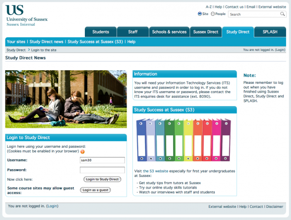
The 2009 login page contained a lot of information and images, which pushed the actual login box down quite far down the screen. We found for users with smaller screens they often had to scroll to enter their login details. For users with screen readers this was a particular problem, as the login box was the very last thing on the page. Although the page has very clear and detailed text everywhere – generally users found it rather over-busy with no clear focus on what the page was, or what they could do here.

2010 login page

2010 Login page

The page now – hopefully – tells you where you are, and what you can do here – sign in.

We also took the time to add a ‘Forgot your username or password’ link and some nice HTML5 form features including :

  • placeholder text – letting the user know what they should enter into a form field
  • autofocus – so the primary form field gets automatic focus when a page is loaded.

Combining the new HTML5 attributes with cleaner CSS and HTML also allowed us to make improvements to the usability, which has a knock-on effect for the accessibility of the page. The sections below the US header now render much clearer with CSS disabled, the TABLES previously used for the form layout have been removed making tabbing faster for screen readers.

The page is also loading much quicker.

Behind the scenes the page doesn’t load all the CSS and JAVASCRIPT  libraries usually loaded on every Moodle page, as it does not need them. It just includes what’s actually necessary for the user to log in.

Some technical stats :

Pre 2010 page 2010 page
Number of http requests 35 10
Size of received response 522.7KB 88.9KB

By reducing the number of http requests to load files we did not need, and reducing the size of the responses by only sending back data we needed we managed to more than half the average page load time.

So far user feedback on the new layout has been very positive, and we hope to be making further improvements to the accessibility as soon.