← blogs.sussex.ac.uk

Improving Moodle import. Part 3: The application

We have developed a new import tool for importing materials from one course to another. The advantages over the Moodle import are:

  • it is easy to use
  • it is reliable
  • it is fast
  • it only imports questions used in the quiz while maintaining question category structures that are used
  • it shares many similarities with our custom rollover tool
  • clicks to import materials is a minimum of 3 compared to the standard moodle which has a minimum of 6
  • it imports embedded files without bringing all files (unlike Moodle 1.9 import)

[vimeo]http://vimeo.com/56977353[/vimeo]

Technical stuff

Anyone with experience of Moodle’s import, backup and restore features will know that reliability is an ongoing problem. If you are in any doubt try following the backup and restore discussions.

Further to this it is still a bit clunky to use. For example, it takes too many clicks, it brings all questions in quizzes whether they are used or not in the quiz you are importing (see bug tracker issue) and, in our version, it does not bring embedded files or images.

Our import does not rely on the backup and restore functionality. This means it does not create a temporary zip of an xml representation of the course and associated files which is useful when transferring courses between Moodle installs and keeping course-based backup, but inefficient when importing materials between courses within a Moodle install. Instead it copies records within tables and data files. As  a result our import is fast and reliable where, in our experience, the standard Moodle import hasn’t been.

Please feel free to ask any questions!

Brighton UX conference 2012

I am relatively new to user experience. My colleague, Stuart, is a keen advocate and a lot of what he says makes undeniable sense. I have therefore started to dip my toe into this new world. I began by reading The Elements of User Experience by Jesse James Garrett. His name made him sound like a cowboy. Not a cowboy as in someone who does building work badly, but a cowboy as in Henry Fonda and this was good enough for me. The book was a good read and gave practical advice for staging and managing the design and implementation of a product; any product but particularly a web site. It included easily accessible process management principles which resonated with my Master’s in software management I completed years ago.

Last November I had my second toe dipping into UX when I attended the Brighton UX conference, and it was an absolute hit with me. It confirmed what I thought. UX covers a lot of the bases of successful software design, implementation and management and is easily accessible.

The first talk, “The web that wasn’t” was given by Alex Wright. This talk gave an overview of Alex’s thought on some technological ideas that got left behind. He premised the conference with three philosophical ideas.

  • First, that a software developer engages with problems which require them to make novel decisions to reach novel solutions. Arguably from a subjectivist epistemology our decisions are always novel but perhaps those made by software developers can be more earth shattering
  • A second, that history does not plot a trajectory of human progress, it simply plots time when things happened and those things things often affect other things
  • And a third, that our society is based on planned obsolescence. As human logic dictates when you shoot you shouldn’t shoot yourself in the foot, so capitalist logic dictates that when you build something to sell you shouldn’t build it to last

[youtube]http://www.youtube.com/watch?v=FwO4kJhfG8U&list=PL8cptV3Wr_XeocnLxunbGTMdu-_ZjOVT5[/youtube]

Ben Bashford gave a talk on future shock. He argued that technology was moving so fast that it is scary to many of us. And that as designers of new technologies we need to make our systems less scary by giving them human traits. Ben proposed we design technology with the traits which we would like our users to think of it, giving it emotion and character.

[youtube]http://www.youtube.com/watch?v=O5EYAlzvyq8&list=PL8cptV3Wr_XeocnLxunbGTMdu-_ZjOVT5[/youtube]

Karl Fast talked about models of learning. He argued in favour of theories of learning that describe the importance of tools and environment to our learning, such as embodied cognition, distributed cognition and activity theory (a personal favourite I am using in my doctorate in Education).

He gave a number of examples to make his point:

  • Its easier to make words in scrabble when we move the letters around to make words
  • Its easier to do a jigsaw puzzle than to think about it
  • Experienced and capable Tetris players over rotate the pieces more than those inexperienced and poor at it. Over-rotation is a pragmatic and epistemic action that is faster, simpler and less prone to error
  • Brainstorming is easier when using sticky notes than retaining the information in our heads
  • When we talk we use our hands. Our hands help express things. This is independent of the person we are talking to. We do it on the phone, we do it when talking with the blind and even blind people do it. The hands are a tool which help us think

He made the point that a phone on its own is useless but a phone in someone’s hand is powerful. Turn this on its head and a person with a phone is more powerful than one without.

We wouldn’t get rid of iPhone, iPad, Facebook or youtube – its the infrastructure for much of our knowledge; information is cheap – understanding is expensive.

[youtube]http://www.youtube.com/watch?v=Isja8AcgHzw&list=PL8cptV3Wr_XeocnLxunbGTMdu-_ZjOVT5[/youtube]

Other talks included Mark Bachler, games designer, who discussed issues that came up when designing natural user interfaces such as the Kinect interface and Guy Smith-Ferrier gave a very amusing talk on neuro headsets which could literally read your brain waves.

[youtube]http://www.youtube.com/watch?v=S2NZLyXWd1I&list=PL8cptV3Wr_XeocnLxunbGTMdu-_ZjOVT5[/youtube]

[youtube]http://www.youtube.com/watch?v=YUyf2j2y25w&list=PL8cptV3Wr_XeocnLxunbGTMdu-_ZjOVT5&index=3[/youtube]

Abstract accepted: Moodlemoot Ireland 2013

Our abstract for Moodle Moot Dublin has been accepted. Woohoo! Here is the abstract we submitted. See you there!

Interface design for rich, beautiful and engaging Moodle courses

Most of our Moodle courses used to look to like messy file repositories. The students’ experience of using them was usually functional, but rarely pleasurable. The courses largely consisted of files for the students to download and open in non-web based, proprietary applications such as MS Word or PowerPoint.

We relatively quickly realised our tutors weren’t doing this by chance. Our tutors are not web designers. They do what the technology they are using encourages them to do. In the case of our Moodle this was to upload resources one after the other with the minimum of context. This usually resulted in the students’ learning sites looking like their tutors’ file directories.

In order to counter this we made a concerted effort to encourage tutors to create rich, beautiful and engaging learning resources for their students. We did not do this by coercion or strict training programmes. We made focused modifications to the Moodle editing interface which changed the tutors’ workflow and enticed them to add inline text, images and videos. This improved the look and feel of the sites and made them easier to use by their students.

This, combined with a focused communications strategy, has made a considerable difference to the learning sites our students are using today. To find out more come to our presentation!!

Improving Moodle import. Part 2: testing

The e-learning team has a long term goal of building our testing framework at the same time as writing the specification of a project – something like a test-driven development environment . As a result of being a small team and the way in which some of our projects grow organically this isn’t always possible.

The Sussex import grew out of a proof concept project that wanted to establish that we could import materials between courses without using the expensive backup functionality. It only became a project when we realised it wasn’t only possible it was immanently sensible. As a result we needed to build in our testing framework after we had written the import feature.

We wanted the testing framework to expose changes to the database contents so we were confident the feature wasn’t compromising data integrity. This would compliment our usual testing.

We looked into the inbuilt Moodle unit tests, which in our 1.9 version of Moodle was based on SimpleTest. We thought that the implementation of SimpleTest in Moodle was potentially powerful because it could run multiple tests before a project went live which establish that the changes haven’t broken the functions being tested.

However, we ultimately decided that SimpleTest was unsuitable in this case because the import creates entities in the database. Running this for each Moodle module every time we wanted to run a unit test would be too labour intensive.

Instead we decided to write our own unit tests (loosely described) which logged the results of the tests in the browser console.

The tests would collect data before and after the import and then compare the data returned. The comparison would give the tested pass and fail results.

The comparison looked at a number of data components including:

Course module count

The course module count established that the course modules in the source course stayed the same and the course modules in the target course incremented by one for each asset imported.

Section count

The section count established that the sections in the source course stayed the same and, if the section of the imported asset existed in the target course, the sections in the target course also stayed the same. And, if the section of the imported asset didn’t exist in the target course, the sections in the target course incremented by one.

Assets count

The assets (module) count established that the assets in the source course stayed the same and the assets in the target course incremented by one for each asset imported.

Asset specifics

The asset specifics tested that modules had been correctly copied. The most complicated module was the quiz. The test established that the source course quiz, quiz questions, question answers and question categories all stayed the same and that a new target course quiz is created, with identical quiz questions and answers put into a new category associated with the course.

An example of how the test data helped

The comparison data would return like this in the browser console:

In the case above it can be seen that there is a problem in the target sections. The details were also stored in the console log so that the programmer could look into the details and see what actually happened.

The details showed that the import did not increment the number of assets added to the section.

The unit tests proved a useful addition to the project allowing us to feel more secure in the fact that the import was not compromising data integrity.

We hope this blog detailing our approach will be useful to others.

As always, your comments welcome!

Better user experience; better learning experience?

In order for students to have great learning experiences, we believe that students, and the people who teach and support them, need to have great user experiences.

That’s been at the heart of the work that we’ve been doing since 2010.

John and I are in Manchester at ALT-C 2012, where we’ve presented a paper exploring this issue.

Better user experience, better learning experience? ALT-C 2012 paper

Moodle usability – interviews from 2010 (#1)

In 2010, Graham MacAllister,  founder of  Player Research, interviewed a number of staff members here at Sussex and videoed them interacting with our old version of Moodle.

These videos – and Graham’s subsequent report – were very helpful to us in deciding on the priorities and approaches to adopt in taking forward the work that we’ve done with Moodle since then.

We can’t post the videos because we didn’t request appropriate permissions from the interviewees, but here is a totally anonymous transcript of a short section of one of the interviews.

This is a screen shot of the Moodle site from 2010 they are looking at:

Interviewer: Imagine if we suddenly decide that it would be much better if it was in 10 sections? How would you go about changing it to 10 sections?

[4 second pause]

Interviewer: If I can ask you,  just to talk out loud about the things you’re looking for or what you would expect.

Staff member:  [replies straight away] Well, we need something to add onto here [with her mouse she is indicating the final section in the 5 sections visible on the screen – marked with a green star on the screenshot] …. but i’m not quite sure how you’d do that [2 second pause]

[starts to look at other parts of the screen – goes to the Site menu – the top left hand block]

Site menu [reads and runs mouse along the link] “Topic 1” [moves mouse across the Section 0 which is parallel to where it says topic 1]

Is that Topic 1? [shakes head][6 second pause in which she shakes head, looks around the page, ]

I really don’t know[now sliding mouse into the sussex library resources block]

[starts reading the list within this block] “Reading lists” [confidently, this is something she recognizes, then tailing off again]

No  [shakes head, looks to bottom of screen and says quietly] I don’t know let’s just go down

[Scrolls a bit further down the page, sighs, sits back in chair in a gesture of defeat] Sorry.

Interviewer: What would you like to  see?

Staff member:  [much more quickly and confidently] Um a drop down menu. [Moves mouse to the Site menu]

Or – [interrupts herself, sounds less confident, moves mouse to Site menu] This is a site menu ..

Interviewer: Mm [neutral tone]

Staff member:  [sigh] [pause][sits back in chair] I just think it’s completely .. [turns to where the interviewer is sitting] confusing

Improving Moodle import. Part 1: the database schema

The Moodle import feature copies resources and activities (mods) from one to course to another. Unfortunately we found the import process rather unintuitive (although better in 2.3), and we wanted to improve its speed, reliability and ease of use.

We found that the Moodle import is based on the Moodle backup feature. Moodle backups create external representations of courses as a zip. It’s great at keeping packaged archives of Moodle courses, and sharing them. However, incorporating backup into the import process meant packaging mods into temporary zip archives and then unpackaging them again, even though all it really needs to do is copy a mod and associated files.

We found that relying on Moodle’s backup wasn’t the most efficient method.   Our new import isn’t based on the Moodle backup functionality and as a result is faster, more robust and easier to use. Unlike the standard Moodle import tool it is also able to copy files linked from html within mods.

In this first of a trilogy of posts we’ll sketch out the database schema we are copying.

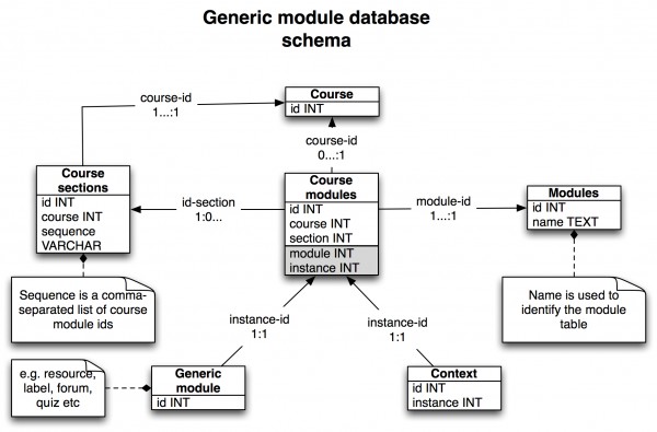
Database schema for generic course modules

The generic database schema for course mods looks like this:

Some of the Moodle mods have no further data associated with them than this. Others only have user generated data which the import doesn’t need to copy.

In our Moodle install mods with no further data associated with them include resources, assignments, chat modules, journals, forums, wikis and labels.

Some of the Moodle mods have subtables associated.

For example the choice mods have an associated table with choice options, the database mods have an associated table with database fields, and the feedback mods have an associated table with feedback items.

The lesson mods have an associated table with lesson pages and these pages have an associated table with lesson answers.

Database schema for glossary modules

The glossary was the only mod where we decided it was important to import user data as these included glossary definitions added by the tutors and a glossary without definitions wouldn’t be worth importing. As a result the database schema was a little more complicated. Glossary mods have associated tables with glossary entries and categories and there is a linking table between entries and categories. Furthermore, entries have an associated table with aliases.

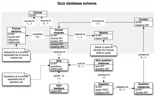
Database schema for quiz modules

By far the most complicated mod was the quiz. The quiz has associated tables quiz feedback and quiz question instances. Quiz question instances joins questions from a Moodle question bank. The questions are in categories which are associated with the quiz itself through the context table.

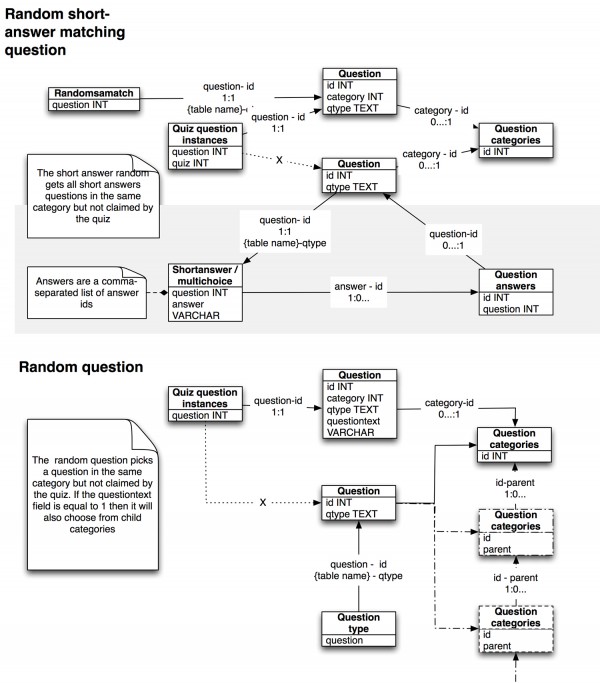
There are number of questions types all using their own database schema. Most of the question types use the question answers table.

There are a number of question types which randomly pick questions. The random short answer matching (slickly named!) picks any short answer question in the category that is not currently in use to make a matching question by pairing the question and answers of the short answer questions.  The random question will pick any question currently not in use in the quiz that is in the same category or a subcategory.

We hope this approach will be useful to others who have problems with import in moodle.

In the next posts we will talk about the unit testing we did to establish that import was working and finally the Sussex import feature in its working form.

As always, comments very welcome.

Moodle icons

Question : What do you need from an open source cms and icons on the web today?

  • Clean separation of content and decorative elements
  • Icons scalable for different devices
  • Optimisation of icons and markup for page loading times
  • Easy to skin/theme

The moodle roadmap currently contains an issue – Completely new default icon set and graphic design – and that is a rather wonderful thing but i will miss the ye olde moodle icons…..

Moodle icons today

Let’s take a look at the current state of moodle icons. I think we all find standard icons in moodle are rather characterful, and somehow our hearts have grown rather fond of them.

They have a fantastic naive charm but unfortunately to the rest of the world something about them instantly makes moodle look cluttered and dated, no matter how modern the theme you apply is.

The same is also unfortunately true for the markup displaying the icons.

<li class="activity forum modtype_forum" id="module-1772">
<div class="mod-indent">
<a href="#">
<img src="http://demo.moodle.net/theme/image.php?theme=nimble&amp;image=icon&amp;rev=500&amp;component=forum" class="activityicon" alt="Forum">
<span class="instancename">News forum</span>
</a>
</li>

It’s a lot of code, for something relatively trivial. In my screen reader this read out “Forum (from img alt tag)  – News forum (from link text)” .

Editing icons are based on the same model :

<a class="editing_moveright" title="Move right" href="#"><img class="iconsmall" alt="Move right" title="Move right" src="http://demo.moodle.net/theme/image.php?theme=nimble&amp;image=t%2Fright&amp;rev=500"></a>

which was read by my screen reader as “Move right (the a title) – Move right (the img alt) – Move right (the img title)” . I can see what the developer is doing here – using alt tags and title tags for accessibility, but unfortunately not achieving what they want.  Other screen readers might read the title, alt or even nothing. Because there is no actual text in the a link, some screen readers will actually read the link as ‘ ‘ or announce the url address. It’s a well intentioned model that we can examine improving.

Icons on the rest of the web

Let’s think about most web icons. They are mostly what is can be described as ‘decorative’. Web standards for accessibility tell us these decorative elements shouldn’t be causing clutter to any users.

Decorative icons don’t need title or alt attributes, the content should always be the text in the actual dom node. Applying this to our code gives us :

<a title="move right" href="#"><img src="http://demo.moodle.net/theme/image.php?theme=nimble&amp;image=t%2Fright&amp;rev=500">Move right</a>

That’s a bit clearer, but we can take it a step further :

<a title='Move right' class='move_right' href="#">Move right</a>

You’ll recognise this approach as those first magic steps to the separation of content and display. There are no erroneous title and alt tags, the simple a href content does most of the work for us as Tim Berners-Lee intended. We are now free to use css to add decorative styles.

.move_right {
text-indent: -3000px;
display:inline-block;
padding-left:16px;
background: transparent url({path to icon}) 0 center no-repeat;
}

One line of css gives us the same as an img tag and src for every move icon on a page. It is a dramatic step towards optimising any site’s performance, while keeping code clean, improving accessibility, maintainability  and  giving us that all important separation of  content from display.

Edit icons as css background-image demo

For activities we can use the same approach:

<li class="activity forum modtype_forum" id="module-1772">
<a href="#">
News forum
</a>
</li>

Activity icons as css background-image demo

Another advantage is that this separation makes it a lot easier for developers to make fantastic themes for a cms.

Fun with html entities as icons

You can also use html entities as decorators to save on http requests and image load time.
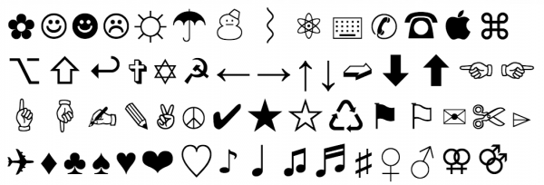
Edit html entity as image demo

Our approach at Sussex

There have been a lot of people asking about our EDITING ACTIVITIES, LABELS & RESOURCE blog post, so here’s  basic walk though.

Without changing the core code changing the icons in moodle is currently an interesting challenge. It involves going through folders in your theme and physically replacing icons while keeping to the naming conventions, icon size, icon mime types and folder structure specific to moodle’s guidelines. For us it proved an insurmountable barrier to integration with other systems where we wanted consistent icons cross cms, or dynamic icons for javascript interactions.

At Sussex we wanted to alter our moodle icons by using a web standards approach based on this separation of content from display, optimisation, accessibility in mind and mobile and cross device adaptability – we are still not there yet, but we plan to be soon. We did, unfortunately,  have to implement the changes to core code outlined above to move towards this.
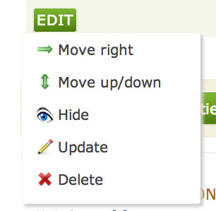
Semantics

First we suppressed all the icons spat out by php in moodle. Second we devised a semantic structure for classes. For resources and activities it follows this pattern :

class="asset {resource or activity} {type} {mime_type}"

This allows you to use css to add icons based on the mime type of a file resource, the resource and/or activity type. It makes the asset itself self describing, the sort of thing that gives a web developer a little glint in their eye when they view source on a webpage (as compared to the sinking feeling of despair you normally get). We could than apply a our png icon set via css, and some sprite icons where appropriate.
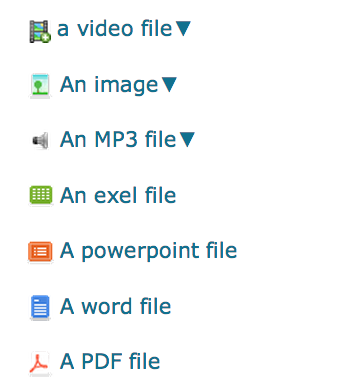
Other icon formats

In other parts, such as the drop down arrows above, we used a combination of html entities and svg icons from the noun project. Path dependency was no longer an issue and we are able to use icons internal and external to moodle, in whatever format was most suitable.

For activities we chose a different approach of using text based ‘faux icons’.
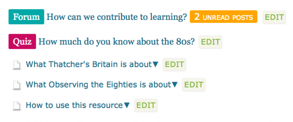
It still relies on the semantic self describing markup, but instead of images we use css to create text ‘faux icons’, such as the Quiz and Forum above, with unique text and background colours.

Activity text ‘faux icons’ css demo

Icons on the web today

The landscape for how you create and use icons has really changed. The principles of keeping content and styling separate are still the golden rule, alongside semantic mark up, accessibility and optimisation of page load speeds – some of our four requirements.

The ability of users to view your content on devices with different pixel densities has opened up a requirement for scalable icons such as svg and font icon sets.

Twitter bootstrap font based icon set
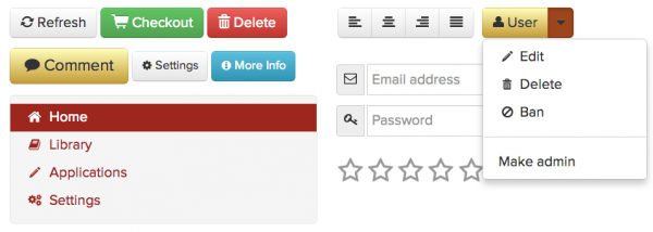

Zurb foundation font based icon set

Next time we re-visit our icons at Sussex we will almost certainly be using a font based icon set. Frameworks such as  Twitter bootstrap and Zurb foundation are already providing beautiful font based scalable icons which can be styled with css – as you would any font.

So what can we takeaway for moodle from this blog post?

It would be great to see moodle moving towards the future in its choice of icon format. Perhaps even more importantly to developers is to see moodle move towards web standards of accessibility, semantic markup and separation of content from display.

Be interesting to see what happens and if you feel strongly about this, as always, please contribute to the future of moodle on the forums and tracker.

100% section titles

Section titles are important for a user to get a good experience of a Moodle site. They are used in the contents menu of the site thus making them primary navigation tools. They are like the chapter names in a textbook. They are essential for giving an overview of the site and for finding content within it. This observation was evident from focus groups we carried out earlier this year.

Section titles are particularly important for us at Sussex because we would like all sections to be a page of their own and thus remove the scroll-of-death problem inherent in Moodle. But in order to do this, whilst ensuring our Moodle is still highly usable in all sites, we need 100% section titles.

However some sites at Sussex still have no section titles at all. The lack of section titles has largely resulted from tutors copying old sites which did not have section titles.

In order to get to a position where all sites use sections as self-contained pages we have altered our interface design to encourage tutors to input a title for their sections.

We have made it particularly obvious to tutors that they have a section which needs a title by re-naming the section “Untitled section“. “Untitled” is the term commonly used to alert users that they need to name something. For example, MS Word and Googledocs use “Untitled document” for unnamed documents.

We have coloured the text green. The colour is significant because we use green all over the site to signify an action is expected by a tutor. For example, all our action buttons are green.

Finally we have made the title mandatory when a user is creating a new section.

Students still see the name of the section as “section x”, where x is a number, so as not to further compound their experience of the site.

We have also made efforts to educate our staff about the importance of section titles. Training sessions emphasize the importance of meaningful section titles and we have a dedicated site for tutors offering practical tips which highlights section titles as an area for concern.

Editing activities, labels & resource

We did some work earlier this year on looking at whats been called moodle’s edit clutter.

The edit clutter can roughly be described as the screen ‘noise’ provided by all the amount of icons on a moodle site when your editing content. Alongside the edit clutter we also tried to help with a common question our tutors ask – ‘What do all these icons mean?’

We tested a few prototype with our users, and after a number of iterations this is resulting design pattern of user interaction.

[vimeo]http://vimeo.com/38561642[/vimeo]

As always, comments and feedback are very welcome.