← blogs.sussex.ac.uk

Recent activity in Moodle

We want our Moodle to be a dynamic online space, but there is a barrier to this.

Currently to spot if any changes have occured to their moodle sites users have to rely on getting email updates or playing spot the difference for each site they have in moodle – often not a simple task.

There is already a solution to this used widely across the web called the updates pattern. The pattern tracks changes that occur which are relevant to the user, and displays them clearly to the user. The pattern is part of addictive design, encouraging users to interact with changes, and when applied to e-learning can lead to a virtuous circle where users are encouraged to engage.

As a result we have developed a recent update feed to which users can subscribe. The feed includes activities, resources and forum posts added to or updated on Moodle courses in the last month, and we consume this feed on the site itself to indicate updates to users, as they happen.

The first five recent updates is available to Moodle users in a drop-down menu available from all Moodle pages. The drop-down includes a link to all recent activity feed items in the last month and the feed itself so users can subscribe to it.

The design pattern used is the updates pattern, which should be familiar to most internet users who use services like youtube, twitter or facebook (as shown below).

So far user testing has proved the drop-down menu to be extremely popular with tutors wishing to disseminate their materials and students wishing to engage in their subjects.

As we are using a standard web pattern most users don’t need any instructions on how to use the updates, they already know.

For a demonstration of the recent updates feature please view our video. Please note our Moodle install is called Study Direct and we call each Moodle course a “site”. [vimeo]http://vimeo.com/27484742[/vimeo]

Moodle breadcrumb

When navigating a web site I like to know where I am so I do not feel disorientated or lost. Most web sites have a breadcrumb bar to help me with this. The metaphor is that the user has left a trail of breadcrumbs whilst traversing the site so he or she can retrace their steps, and thus originally the breadcrumb represented where a user had been on the site. In modern web sites however, the breadcrumb bar more often represents where I am in relation to the hierarchy of the site as I am as likely to have found my way to the page via a search engine. A discussion was started on Moodle.org regarding the fit for purpose of the native Moodle breadcrumb which has prompted me to blog about it here.

In our Moodle install the native breadcrumb bar looks like this when viewing a forum:

native moodle breadcrumb bar

There a number of things about the native breadcrumb that we do not like.

It does not include a link to the course section that the forum is on. It therefore doesn’t help me retrace my steps or tell me where I am in the course site.

The list of forums (sic) is a strange view of the course where I can see only the instances of forums on the site. If I were viewing another activity-type or resource-type I would have a link to a list of resources and activities of only that type. We feel this view of the site is unhelpful and that students should be seeing the activities and resources in the context that the tutor intended.

The short name of a Sussex Moodle site is concatenation of the course code and the year the course is running. As our Moodle courses are dynamically created we cannot generate a more friendly short name. We allow tutors to update the short name but they rarely do. Therefore the use of the short name in the breadcrumb bar only serves to display text which is nonsensical to the majority of students.

We have therefore made three significant customisations to the breadcrumb bar. One, we have added the course section. Two, we have removed the link to the lists of resources and activities of the same type. Three, we use the course full name. In our Moodle install the breadcrumb bar looks like this when viewing a forum:

study direct breadcrumb bar

The programmatic changes to do this were in the build_navigation function in /lib/weblib.php and in course/modedit.php. We have detailed them below.

In weblib.php at around line 3850 update:

'name' => format_string($COURSE->shortname),

to:

'name' => format_string($COURSE->fullname),

and at around line 3875 update:

$navlinks[] = array('name' => get_string('modulenameplural', $cm->modname),'link' => $CFG->wwwroot . '/mod/' . $cm->modname . '/index.php?id=' . $cm->course,'type' => 'activity');

to:

$topic = get_record('course_sections','id',$cm->section);
if (empty ($topic->name)) {
$format = ucfirst(substr($COURSE->format,0,-1));
$topic->name = "$format $topic->section";
}
$navlinks[] = array('name' => $topic->name, 'link' => "$CFG->wwwroot/course/view.php?id={$COURSE->id}&topic={$topic->section}", 'type' => 'topic');

In modedit around line 438 update:

$navlinks[] = array('name' => $strmodulenameplural, 'link' => "$CFG->wwwroot/mod/$module->name/index.php?id=$course->id", 'type' => 'activity');

to

if (empty($sectionid)) { $sectionid=$cw->id; }
$topic = get_record('course_sections','id',$sectionid);
if (empty ($topic->name)) {
$format = ucfirst(substr($COURSE->format,0,-1));
$topic->name = "$format $topic->section";
}
$navlinks[] = array(
'name' => $topic->name,
'link' => "$CFG->wwwroot/course/view.php?id={$COURSE->id}&topic={$topic->section}",
'type' => 'topic');

Data data everywhere…

The Me2U project that’s investigating the use of Echo360 personal capture is – as far as data collection is concerned – entering its final phase.

We have been going along to the teaching sessions for those courses that have been using Echo360 PCAP to distribute questionnaires to students and invite them to participate in focus groups to find out more about their experiences of watching the screencasts. Given that this work has taken place within the space of a couple of weeks, we now have a pile of questionnaire data to input…then analyse…then interpret in relation to the other data we have collected.

I’m not complaining – without the data we couldn’t say very much about what the students think of the recordings that the lecturers have invested their valuable time in creating. Its just that at this moment, staring at the tower of paper, its a little daunting to think how all the different pieces will fit together to form  a coherent story about the extent to which the screencasts have helped students to put their learning into context.

Questionnaire sheet

A criticism of research into learning developments is that they sometimes don’t tend to go beyond a conclusion of ‘the students liked what the teachers did’. It is often very difficult to gauge the effect of an intervention on student learning given the multi-factorial influences on a student’s experience on a course. There have been numerous discussions, research articles and reviews about what constitutes ‘evidence’ in educational developments. It is very tricky, for example, to have control and experimental groups in this field, although there are rare examples of studies where this approach has been taken.

So what about the Me2U project? We are using four sources of data:

  1. Questionnaire data from students
  2. Focus group data from students
  3. VLE log data on student access to the screencasts
  4. Interviews with staff

The questionnaire data will answer the ‘did the students liked what the teachers did?’ question (the answer to this will almost certainly be positive, as students like resources). However, it will also help us to understand more about which aspects of the students’ learning the screencasts supported, how often they viewed recordings and on which devices the recordings were viewed. It will also allow us to see if there is any relationship between a student’s technical confidence and whether they watched the screencasts. The focus group data will help expand on our findings from the questionnaire data and enable us to better categorise the main areas of learning that these short screencasts can support.

I have talked about the use of VLE logs in a previous posting. We could look at the extent to which individual students have accessed the recordings and their performance in assessment tasks (or compare a current cohort’s performance with a previous year).  However, as I mentioned above, the factors that will affect these variables would swamp any potential effect of screencasts.

Instead, I see the logs as contributing  to our understanding of when it is optimum to release the screencasts to students and the type of screencasts that were viewed most often by students. This will help to promote the use of short screencasts with staff  – given their time is in such short supply, they will want to know how to make sure the students get optimum use of the recordings.

Finally, the interviews with staff are critical. We all know that the academic staff are more likely to be persuaded by their peers than by those of us in learning development. If our participants discuss their use of Personal Capture and are willing recommend it to their colleagues then the barriers to the uptake of screencasts will be lowered.

What I hope is that the project will be able to provide some sensible recommendations – that are supported by evidence – to staff about effective deployment of screencasts to support student learning The next couple of months will reveal whether or not this can be achieved…

Echo360 Community Conference Europe 2011

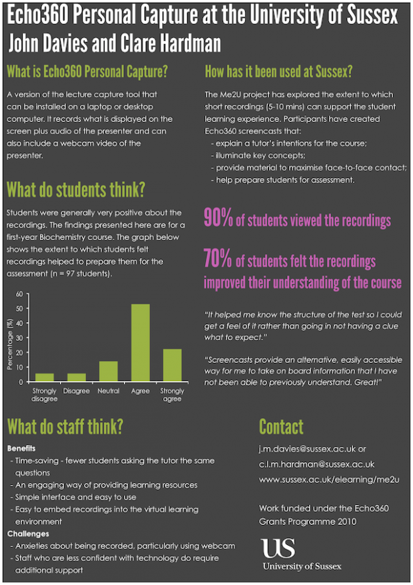
I went to the Echo360 Community Conference, Europe on 25th May 2011. I presented a poster at the conference, that provided an overview of the project I’m leading on the use of personal capture to support student learning. A PDF version of the poster can be downloaded by clicking on the image below.

I also gave a short presentation about the project – this was recorded, and I’m guessing will be made available on the Echo360 website shortly.

Echo360 Conference poster

Moodle pages format

Here is a short video of a new format (for moodle2 and 1.9) we are currently calling pages.

[vimeo width=”700″ height=”490″]http://vimeo.com/23476517[/vimeo]

We hope the pages format is similar to design patterns used in other websites, CMS and web based apps and as such familiar and intuitive for users. A by-product the pages format is that there is no ‘scroll of death’ normally associated with moodle.

The format aims to improve the workflow for tutors creating content in moodle and improve navigation, overall usability and contextual information for students.

Creating groups automatically in Moodle

At their MoodleMoot UK 2011 presentation, Paolo and Stuart outlined some of changes that have been made to Study Direct (Moodle at Sussex) to improve the user experience for both staff and students. Improving the ‘groups’ feature in Moodle was one such development and the changes made went live at the start of the Summer Term 2011.

Paolo has already written a post that describes the improvements made to the groups functionality. To support our users we will produce some screencasts that will not only demonstrate the process of how to create groups, but also include scenarios that describe how groups can be used to support both learners and tutors. This post includes the first such screencast.

For some time, staff at Sussex had requested an easy way of setting up groups in Moodle that reflected face-to-face teaching groups (e.g. seminar groups, laboratory classes). Previously, these groups had to be set up manually by adding individual students to each group. Some of the larger courses (modules) have 250 students with up to ten teaching groups, so creating these groups within Moodle is a time-consuming process. The developments that have taken place enable the information about teaching groups in the courses database to be imported in Moodle, so it now only takes a small number of clicks to create these groups.

This screencast for our tutors demonstrates how this new feature works.

[vimeo width=”640″ height=”480″]http://vimeo.com/21801946[/vimeo]

An example at the University of Sussex where the groups function in Moodle has been used to recreate existing teaching groups can been seen in the presentation given by Dr Andrew Chitty at one of our Study Direct users’ meetings. Andrew used forums extensively to support face-to-face seminar discussions – he wanted to create an online space where students could discuss topics in their seminar groups. The point at which Andrew’s course ran was before the work on creating groups automatically had been released so, unfortunately, Andrew had to create the groups manually. When the course runs next year, this feature will be a real time-saver for Study Direct users like Andrew.

Making your WYSIWYG content look the same when editing as when published

For any content author there is nothing worse than applying formatting in a WYSIWYG editor, and then finding it all looks different when they publish it. This applies to our tutors in moodle too.

Making the WYSIWYG editor content look the same as when its publish is something we did a while back in moodle. People at moodlemootuk2011 showed an interest in implementing in their moodle installs, so here is how we did it.

Here is a screenshot of  the WYSIWYG editor in our moodle1.9 with some sample text :

And here is the same content when published :

As you can see Headings, paragraphs, lists, italic, bold and all other semantic text elements have the same formatting in the editor, as when they apear in the published web page.

If your trying to achieve nice looking content and don’t have this correlation it can easily lead to a lot of frustration and confusion from users.

CSS

In your theme you need a css file which has all your styles which apply to text e.g. h1,h2,p,ul,ol, a, small, strong, em, sub, sup etc…

Lets call this file text.css

It’s good practice to take all these text/font styles out of the main theme style sheet, and include this text.css in your theme. That way when you edit the text.css it maintains consistency across your site.

e.g. in the config.php we include the layout.css and the text.css

$THEME->sheets = array('layout','text');

In the WYSIWYG editor

Now you just need to include this text style sheet in the WYSIWYG editor iframe.

In lib/editor/htmlarea.php set the path to your theme and the text.css

$theme_css = "$CFG->wwwroot/theme/$theme/text_style.css"; // theme css text styles

find the comment // Generate iframe content and in the javascript add echo your theme text styles into the iframe header

<style type="text/css">@import "<?php echo $sussex_css;?>";

n.b. moodle2  uses the standard Tinymce WYSIWYG editor. For anyone familiar with this, just follow the normal Tinymce method for adding editing styles, or in the moodle version of Tinymce look for $contentcss and add your theme text.css there.

Now any changes you make to your text.css in a theme will be reflected on the site and in the WYSIWYG editor.

Moodle Moot UK 2011 presentation

Our abstract to present at the UK Moodle Moot 2011 has been accepted. Hurrah!  We will be presenting at Senate House, University of London, on Wednesday at 11:45. Hopefully I’ll have a suntan as I will have just returned from Tenerife.

We have made a post on the Moot blog, which has just been published. We’d love your comments.

This is our 200 word abstract:

This presentation is based on five years of Moodle development.  Sussex University runs a large Moodle installation with approximately 9,000 users logging in per week. In order to improve the experience of our users we have made a number of developments and customisations that will interest other institutions that wish to improve the user experience of their teachers and learners.  For example

  • We have a tight integration with our institutional data so staff and student information, profile pictures, course modules, memberships and teaching groups are represented in our Moodle install. This enables our learning environment to be aligned to Sussex systems and curricula and reduces duplication of effort and teachers workload
  • We have improved the interface to Moodle so that users can navigate the course sites more easily and are not overwhelmed with information
  • We have improved tools for site development so tutors have a quick settings bar, an improved interface for choosing resources and activities and the option to provide an identifying image for a Moodle course

We’d like this presentation to contribute to a dialogue with Moodle managers and developers in order to improve the services that we can offer in all our educational institutions.

Using Echo360 personal capture using Echo360 personal capture

OK, so that all sounds a bit circular, but this blog post is about one of the ways in which we are creating guidance for those thinking about using Echo360 personal capture (PCAP).

One of the outputs that we hope will have a really positive impact is the short screencasts that we are asking project participants to record. These will outline how they used PCAP, the benefits of using the tool and any issues they encountered. These will be produced alongside the more usual written case studies that will give insights into how Echo360 personal capture can be embedded effectively in teaching and learning.

We will be asking most of the project participants to record a screencast that outlines their experiences of using personal capture. The first to take up our offer is Mick Frogely, Senior Lecturer in Phsyical Geography – go to the Sussex elearning website watch his screencast.

I think that producing a PCAP screencast about the use of the tool is powerful for a number of reasons:

  • It provides an immediate example to potential users of an Echo360 personal capture screencast
  • It may have more of a impact on academic staff, given that it has been recorded by one of their peers
  • It can be more personal than a written case study
  • It gives an alternative format to the written case study – suiting visual learners