


Sue Robbins is Senior Lecturer in English Language and Director of Continuing Professional Development in the School of Media, Arts and Humanities.
Evidence-informed Teaching
Whereas research-informed teaching refers to the different ways in which students are exposed to research content and activity during their time at university, evidence-informed teaching refers to the teaching practices that research has shown will have the greatest impact on student learning.
Evidence-based practice is an approach that focuses practitioner attention on the use of empirical evidence in professional decision-making and action. As teaching practitioners, we draw on a range of sources of teaching knowledge, amassed over time. Evidence-informed teaching involves bringing together research from the Scholarship of Teaching and Learning (SoTL) with context and experience to see what works for us and for our learners.
The way evidence works to inform teaching and learning may not always be straightforward, perhaps because learning is the result of such a huge number of interactions, and research findings may sometimes be difficult to implement because it is unclear how to transfer the skills and expertise of teaching. But being familiar with relevant research evidence can help us think about the methodology we select to underpin the design of a module and help students achieve the learning outcomes, including theories of learning, our choice of materials, and classroom procedures. There’s useful information for Sussex colleagues on Educational Enhancement’s SoTL webpage here.
It is also the case that claims for the efficacy of a particular practice can sometimes be made without a broad enough evidence base, leading to the overgeneralising of concepts and ideas. This flipped learning remains under-theorised infographic synthesises the findings from a scoping review which found that despite the rapid growth in the number of articles about flipped learning, most of them failed to elaborate theoretical perspectives, making an analysis of its efficacy difficult.
The Evidence-informed-teaching Infographics Project
The Evidence-Informed-Teaching Infographics Project is a collaborative scholarship project designed to create a set of infographics which synthesise SoTL research in an attempt to bridge the research-practitioner divide. Sussex colleagues can be part of this cumulative knowledge-building project and contribute to the shared knowledge base of evidence that can positively impact student learning by contributing an infographic summary of a journal article that relates to your own interests or teaching practice.
The project began in the School of Media Arts and Humanities and is now expanding to all Schools. The infographics completed so far have been published on the MAH Scholarship blog, and other publishing opportunities will be available as the project expands, offering you an audience for your scholarship.
Reasons to join in
Evidence-informed faculty can make significant contributions to learning, teaching, assessment, and scholarship in their Schools and institutions. A recent post on the WONKHE blog makes the point that ‘robustly evidence-informed education is fundamental to supporting the development of ethical, sustainable and inclusive pedagogies to support learners.’
The Evidence-Informed-Teaching Infographics Project can play to your interests, wherever they lie. You might take a key journal article to summarise because you’ve noticed something in your own practice or teaching context that you’d like to know a bit more about; or you’ve been doing something for a while and want to see what current research says about it. Or it could be that you begin with the literature and identify something that you’d like to try out in your teaching or use it to adjust something you have been doing to better reflect research findings.
Summarising the research on an aspect of teaching and learning can help you distil your thinking, and sharing the infographic with colleagues to inform their practice is a generous way of passing on knowledge. The activity is manageable in size and can be a good way to find out more about teaching-related research, both through creating your own infographic and by reading those created by colleagues.
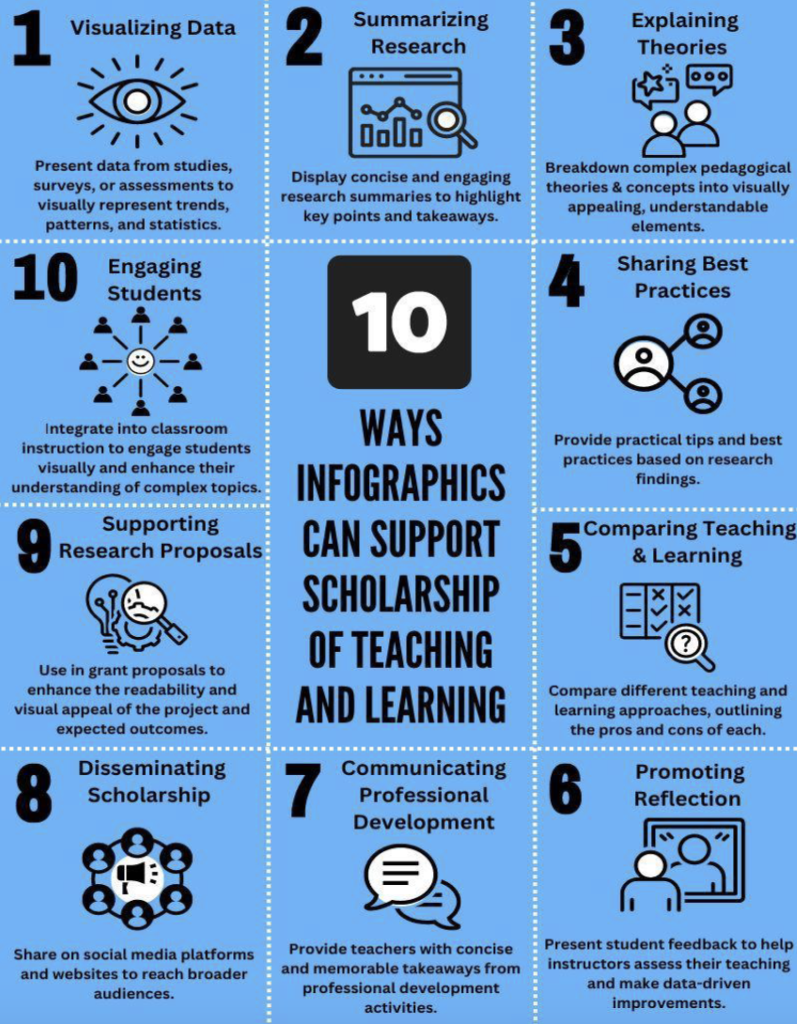
Keogh et al. (2024), writing about their own project designed to share health research with the public, comment on the huge potential of infographics to communicate SoTL to various stakeholders as summarised in this infographic:
Creating and sharing your infographic
To create the infographics, colleagues in MAH have used the design tool Canva, which offers free access to educators. Canva offers a huge range of editable templates and when you have synthesised the key points of your article and can see how many sections you need, you can pick an appropriate one and copy/paste content into it. It’s worth noting that not all of the Canva templates meet the expected accessibility requirements, but the Educational Enhancement team are happy to advise.
Get in touch
It’s a great project to be involved with. Get in touch with Sue Robbins, Senior Lecturer, Department of Languages, MAH if you are interested – S.Robbins@sussex.ac.uk, or with Sarah Watson, Academic Developer –Sarah.Watson@sussex.ac.uk. All welcome!
References
Black, K. (2024). Doing academic careers differently. Retrieved from https://wonkhe.com/blogs/doing-academic-careers-differently/
Educational Enhancement, University of Sussex (n.d.). Scholarship of Teaching and Learning. Retrieved from https://staff.sussex.ac.uk/teaching/scholarship-of-teaching
Keogh, B., Nowell, L., Laios, E., McKendrick-Calder, L. Lucas Molitor, W., and Wilbur, K. (2024) ‘Using Infographics to Go Public With SoTL’. Teaching and Learning Inquiry 12 (March). Retrieved from https://journalhosting.ucalgary.ca/index.php/TLI/article/view/78078
Robbins, S. (2023). Flipped Learning Remains Under-theorised. Retrieved from https://blogs.sussex.ac.uk/mah/2023/04/24/flipped-learning-remains-under-theorised/
School of Media, Arts and Humanities, University of Sussex (n.d.) Scholarship in Media Arts & Humanities. Retrieved from https://blogs.sussex.ac.uk/mah
[…] The Evidence-Informed-Teaching Infographics Project: a novel and engaging way to communicate scholar… […]